
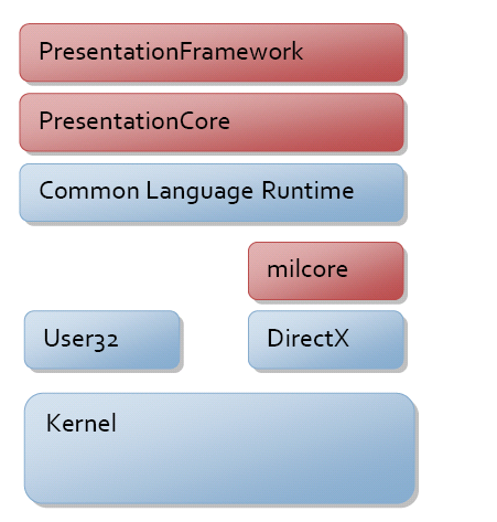
WPF 는 아래의 구성에서 빨간색 표시된 다이어그램이다. milcore 는 DirectX를 위한 코드이어서 native이고 나머지는 managed 코드이다.
System.Threading.DispatcherObject
DispatcherObject는 WPF의 대부분의 클래스의 부모클래스로 정의된다. 이는 여러개의 쓰레드간의 데이터를 주고받을 수 있도록 CLR 객체를 생성하여 STA 동작이 되도록 한다.
Dispatcher를 통해서 메시지를 큐에 쌓아서 순차적으로 동작을 하면서 단일 쓰레드에서 UI를 제어 할 수 있도록 한다.
관련된 것이 cross thread exception, deadlock, race condition과 같은 문제를 방지하기 위한 것이다.
System.Windows.DependencyObject
DependencyObject 또한 WPF 에서 가장 중요한 구성요소이다. DependencyObject 는 MVVM 패턴에서 View와 ViewModel 간의 binding을 연결하여 property 의 변경에 따른 이벤트를 발생하여 데이터가 변경되었다는 것을 인지하고 그에 따른 UI를 변경할 수 있도록 한다.
내부적으로 값이 변경되었을 때 INotifyPropertyChange 이벤트를 발생시켜 bind 되어 있는 객체가 알 수 있도록 한다.
이 외에 다른 사용은 아래를 참고하자.
Custom Controls: When you create a custom control in WPF, you typically derive it from a base class like System.Windows.Controls.Control or System.Windows.Controls.ContentControl. These base classes derive from DependencyObject, which means that your custom control can take advantage of WPF's property system and support dependency properties. By defining your own dependency properties, you can customize the behavior and appearance of your control.
public class MyControl : Control
{
  public static readonly DependencyProperty MyTextProperty =
      DependencyProperty.Register("MyText", typeof(string), typeof(MyControl));

  public string MyText
  {
    get { return (string)GetValue(MyTextProperty); }
    set { SetValue(MyTextProperty, value); }
  }
}
Data Binding: Data binding is a powerful feature of WPF that allows you to create dynamic and interactive user interfaces. The binding system relies on DependencyObject to track changes to the data and update the UI accordingly. When you bind a property of a UI element to a data source, WPF automatically creates a binding expression that specifies the source property, the target property, and any converters or validation rules that are required.
<TextBox Text="{Binding Path=MyProperty}" />
Styling: WPF's styling system allows you to define a set of reusable styles that can be applied to UI elements throughout your application. Styles are based on DependencyObject, which means that they can use dependency properties to define their behavior. By defining a set of styles that use dependency properties, you can create a consistent look and feel for your application.
<Style TargetType="Button">
  <Setter Property="Background" Value="Red" />
</Style>
Animation: WPF supports animation of UI elements, and this is also based on the DependencyObject. You can create animations that target dependency properties, and WPF will automatically update the values of these properties over time. This allows you to create rich and dynamic user interfaces that respond to user input.
<Rectangle Width="50" Height="50">
  <Rectangle.Triggers>
    <EventTrigger RoutedEvent="Rectangle.Loaded">
      <BeginStoryboard>
        <Storyboard>
          <DoubleAnimation Storyboard.TargetProperty="Width"
                            From="50" To="100" Duration="0:0:2"
                            AutoReverse="True" RepeatBehavior="Forever" />
        </Storyboard>
      </BeginStoryboard>
    </EventTrigger>
  </Rectangle.Triggers>
</Rectangle>
Attached Properties: Attached properties are properties that can be attached to any object, and they are defined as dependency properties. This allows you to add additional functionality to existing UI elements without having to modify the element itself. For example, you could define an attached property for a Grid layout that specifies the row and column positions of child elements.
public static class GridProperties
{
  public static readonly DependencyProperty RowProperty =
      DependencyProperty.RegisterAttached("Row", typeof(int), typeof(GridProperties));

  public static int GetRow(UIElement element)
  {
    return (int)element.GetValue(RowProperty);
  }

  public static void SetRow(UIElement element, int value)
  {
    element.SetValue(RowProperty, value);
  }
}System.Windows.Media.Visual
Visual element 를 화면에 그리는 rendering을 수행한다. Visual 은 UI control 을 포함한 모든 visual elements 를 그리는 역할을 한다. 또한 Transform, manipulating, visual effect와 관련된 작업을 수행하며 UI 동작과 연계된 작업을 수행한다.
UI Control : 'Button', 'TextBox', 'ListBox' 등..
Shapes: WPF provides a number of built-in shape classes, such as Rectangle, Ellipse, Line, and Polyline, that can be used to draw basic shapes on the screen.
Text: WPF provides several classes for displaying text, including TextBlock, Label, and TextBox.
Images: WPF supports a variety of image formats and provides several classes for displaying images, including Image, BitmapImage, and DrawingImage.
Media: WPF provides support for playing audio and video files, including the MediaElement class.
3D Graphics: WPF includes support for 3D graphics and provides a variety of classes for creating and manipulating 3D objects, including ModelVisual3D, Viewport3D, and GeometryModel3D.
DrawingVisuals: DrawingVisual is a low-level visual element that can be used to draw custom graphics using a DrawingContext.
Adorners: Adorners are a type of visual element that can be used to overlay controls and provide additional visual feedback or behavior.
System.Windows.UIElement
UIElement 는 Visual 의 자식 클래스로 OnRender 를 이용하여 visual 요소를 그린다. 하지만 Visual 에서 더 확장된 것은 layout 의 개념이다. Layout 을 수행함으로써 하위 객체들이 어느 영역에 어떤 크기로 위치 할 지를 수행한다.
또한 사용자와의 키보드, 마우스와의 입력에 관한 이벤트를 처리하며 자식 element 로 전달까지 한다.
System.Windows.FrameworkElement
FrameworkElement 는 UIElement의 자식 클래스이다. UIElement 의 layou 의 기능을 더욱 확장한 기능을 제공한다.
주요한 기능으로는 Binding 과 Styling 이다.
Binding 는 Element 와 데이터를 연결하여 상호 작용하고 업데이트 될 수 있도록 한다. 관련하여서는 DataTemplate 이용하여 데이터를 어떻게 나열하여 보일지를 지정할 수 있다.
Styling 은 DataBinding의 간단한 형태앋. DataBinding 을 통해 공유되는 Property 를 변경할 수 있으며 이는 TargetType을 지정할 경우 특정 또는 관련된 모든 인스턴스의 Property 를 변경 할 수 있도록 한다.
System.Windows.Controls.Control
Control 은 FrameworkElement 의 자식 클래스이다. Control 은 주요 기능은 다음과 같다.
- Control Template: Control provides a ControlTemplate property that can be used to define the visual appearance of the control. The ControlTemplate is a template that defines the visual tree of the control, including its child elements and their properties. It can be customized to create a unique look and feel for the control.
<Button Content="Click me!">
    <Button.Template>
        <ControlTemplate TargetType="{x:Type Button}">
            <Grid>
                <Ellipse Fill="Red" />
                <ContentPresenter HorizontalAlignment="Center" VerticalAlignment="Center" />
            </Grid>
        </ControlTemplate>
    </Button.Template>
</Button>- Visual States: Control provides support for visual states, which allow you to define different visual appearances for the control based on its state. For example, a button can have different appearances when it is in its default state, when it is pressed, or when it is disabled. Visual states are defined using XAML markup and can be changed
<Button Content="Click me!">
    <Button.Style>
        <Style TargetType="{x:Type Button}">
            <Setter Property="Background" Value="Green" />
            <Setter Property="Foreground" Value="White" />
            <Style.Triggers>
                <Trigger Property="IsMouseOver" Value="True">
                    <Setter Property="Background" Value="Yellow" />
                    <Setter Property="Foreground" Value="Black" />
                </Trigger>
                <Trigger Property="IsPressed" Value="True">
                    <Setter Property="Background" Value="Red" />
                    <Setter Property="Foreground" Value="White" />
                </Trigger>
            </Style.Triggers>
        </Style>
    </Button.Style>
</Button>- Commanding: Control provides support for commanding, which allows you to associate a control with a command that is executed when the control is interacted with. Commands can be used to implement common user interface actions, such as Cut, Copy, and Paste.
<Button Content="Cut" Command="ApplicationCommands.Cut" />- Focus Management: Control provides support for focus management, which allows you to control which control has the input focus. This is important for implementing keyboard navigation and accessibility features.
<TextBox x:Name="MyTextBox" />
<Button Content="Click me!" FocusManager.FocusedElement="{Binding ElementName=MyTextBox}" />- Default Styles: Control provides default styles for its subclasses, which define the default appearance and behavior of the control. These styles can be customized to create a custom look and feel for the control.
<Window.Resources>
    <Style TargetType="{x:Type Button}">
        <Setter Property="Background" Value="Blue" />
        <Setter Property="Foreground" Value="White" />
        <Setter Property="Margin" Value="10" />
    </Style>
</Window.Resources>

<StackPanel>
    <Button Content="Button 1" />
    <Button Content="Button 2" />
    <Button Content="Button 3" />
</StackPanel>위의 Visual State 를 XAML 에서 Animation 효과로 상태를 변경하기 위해서 VisualStateManager를 사용한다.
VisualStateManager is a class in WPF that provides a way to define and manage visual states for controls. It allows you to define different visual states for a control, and to transition between those states with smooth animations.
Here are some key features and benefits of VisualStateManager:
- States: VisualStateManager allows you to define different visual states for a control. For example, you might define a state for when a button is in its default state, and another state for when it is pressed.
- Transitions: VisualStateManager provides a way to transition between states with smooth animations. You can define animations that occur when a control enters or exits a state, or when it transitions from one state to another.
- XAML Integration: VisualStateManager can be used with XAML markup, making it easy to define and manage visual states for controls. You can define visual states and animations directly in XAML, without having to write any code.
- Accessibility: VisualStateManager can be used to provide better accessibility for controls. For example, you might define a state for when a button is disabled, and another state for when it is enabled, with different visual cues to help users understand the control's state.
<Button Content="Click me!">
    <VisualStateManager.VisualStateGroups>
        <VisualStateGroup x:Name="CommonStates">
            <VisualState x:Name="Normal" />
            <VisualState x:Name="MouseOver">
                <Storyboard>
                    <ColorAnimation Storyboard.TargetName="BackgroundBrush"
                                    Storyboard.TargetProperty="Color"
                                    To="Yellow" Duration="0:0:0.2" />
                </Storyboard>
            </VisualState>
            <VisualState x:Name="Pressed">
                <Storyboard>
                    <ColorAnimation Storyboard.TargetName="BackgroundBrush"
                                    Storyboard.TargetProperty="Color"
                                    To="Red" Duration="0:0:0.2" />
                </Storyboard>
            </VisualState>
        </VisualStateGroup>
    </VisualStateManager.VisualStateGroups>
    <Button.Background>
        <SolidColorBrush x:Name="BackgroundBrush" Color="Green" />
    </Button.Background>
</Button>